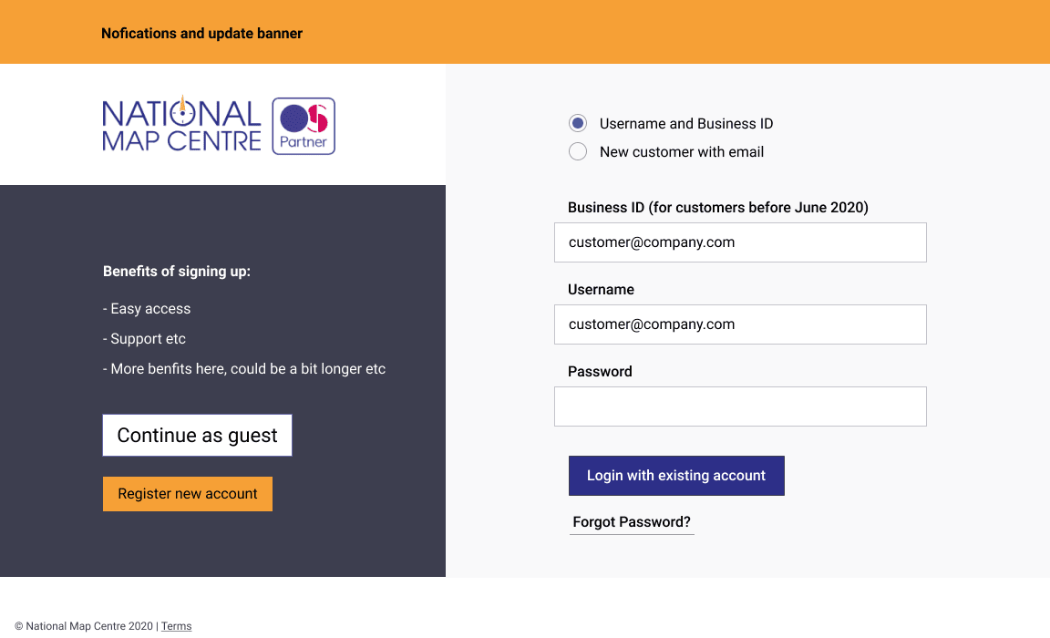
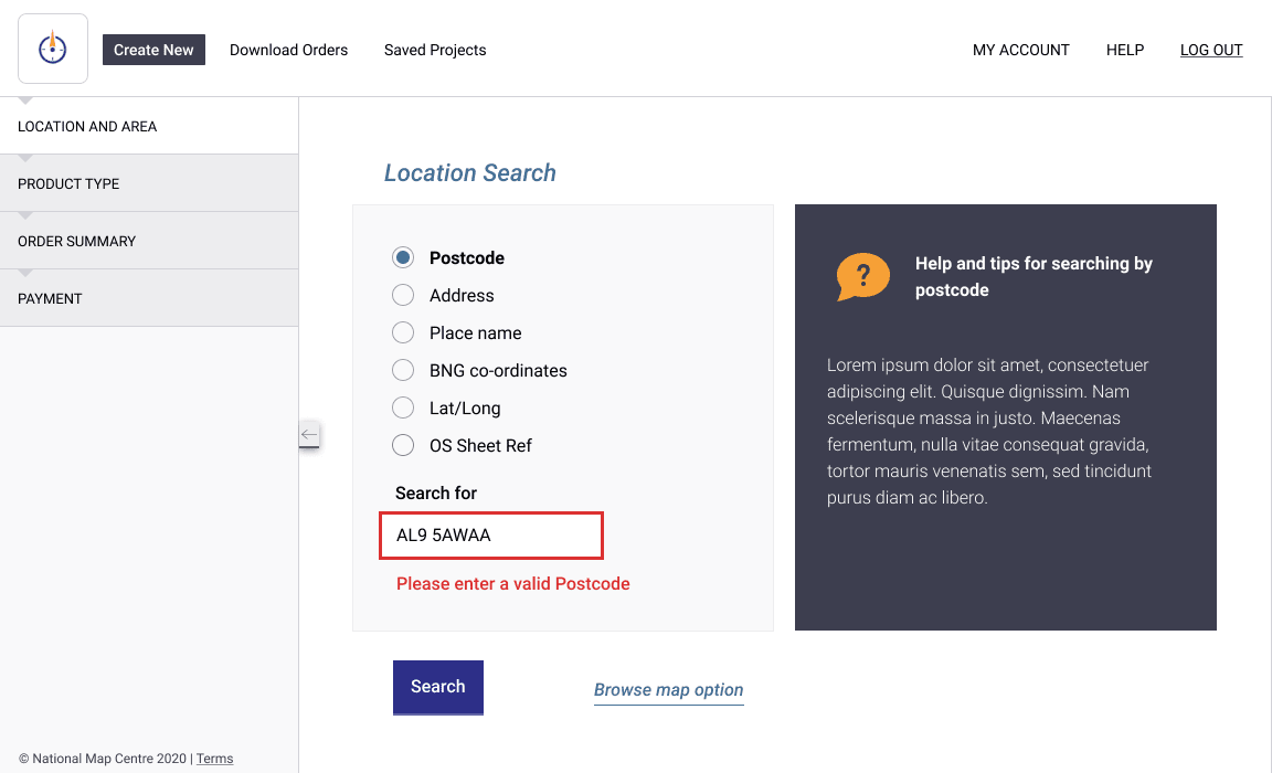
Brand updates, UI and UX for National Map Centre App
Updating and iterate the design for detailed map ordering service
The National Map Centre supply detailed OS maps to a range of sectors and clients. Migrating from a legacy Flash app is an opportunity for a fresh approach a design update with a focus on ease-of-use for both new, occasional and experienced customers.
Research and understanding of business and customer has been a key part of the process with a multitude of differing complex options available. My role here is to establish a design system, so establishing some brand base styles for colour and typography. A component system was then developed to test a number of user scenarios and test new product flows and options.
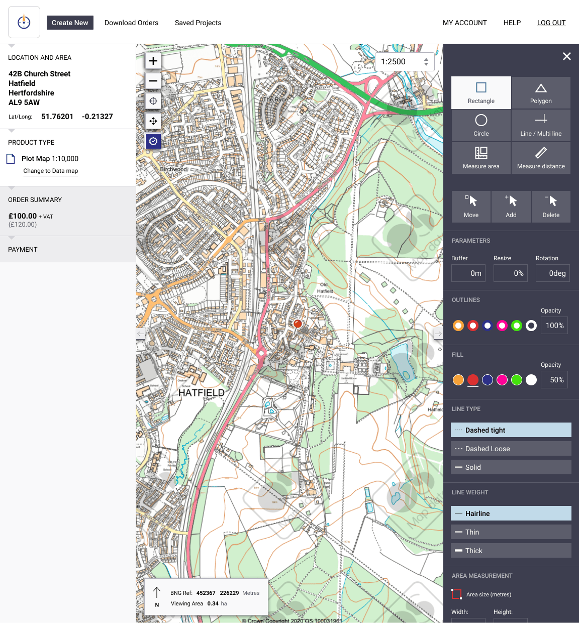
Contextual UI and Tools Palette
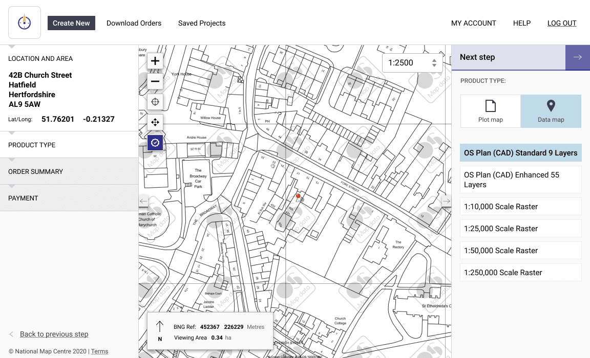
A feature that is used by some customers extensively but not by others is now layered. Available actions are contextual to the product selected to maintain focus. By utilising Figma components, we were able to rapidly prototype a number of customer journeys in context.
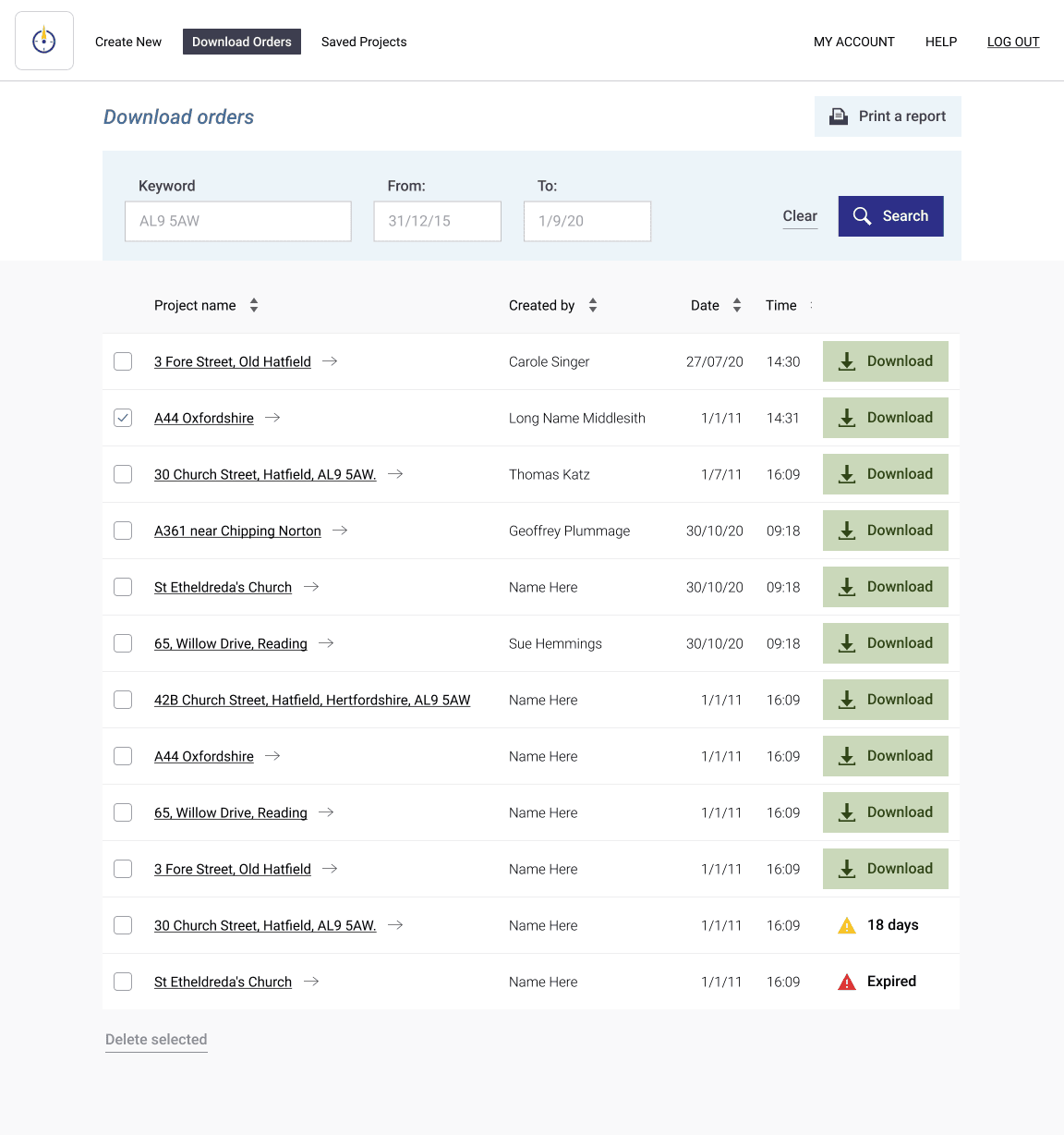
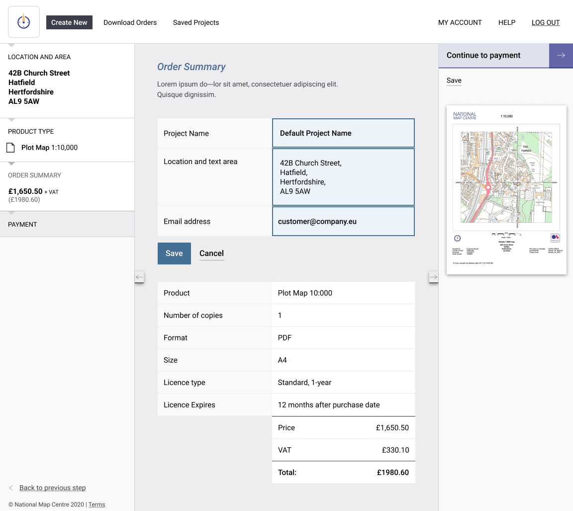
Customer ordering process and editing options
A number of historical constraints and technical parameters come into play throughout the ordering process. A flexible UI that respects these element, but feeling fresh, has been been realised.
